Contents
- 1 What is the Purpose of Graphical Analysis?
- 2 How to decide direction of data collection?
- 3 What is the basis of Alternate Hypothesis?
- 4 What are the objectives of Graphical Analysis?
- 5 How to Analyze One Parameter
What is the Purpose of Graphical Analysis?
The purpose of graphical analysis is to have fair estimation of what is happening in the process apart from rationalizing resources and setting direction of decision making.
Minitab makes graphical analysis very simple. It allows all types of graphical presentation required for quick decisions.
How to decide direction of data collection?
We should direct our resources for further analysis based on graphical analysis. For example, if graphical analysis indicates values are increasing, we need to collect data on higher side only for further validation of what is happening in process. If graphical analysis was not done the data will be collected in irrelevant ranges wasting our resources.
What is the basis of Alternate Hypothesis?
In the Hypothesis Testing, the alternate hypothesis can be any one of the three options viz. not equal, less than or greater than. If graphical analysis is not used, the only option of alternate hypothesis is "not equal to". In this case, the risk of decision doubles compared to when alternate hypothesis is "less than" or "greater than". Graphical analysis clearly indicates which alternate hypothesis is the best option. Further details on hypothesis testing will be given in our subsequent articles.
Caution: Graphical analysis should never be used for concluding. It can only give direction for decision making and further analysis.
What are the objectives of Graphical Analysis?
Graphical analysis is done for
- Analyzing one parameter (performance or control)
- Understanding relationship between multiple parameters
How to Analyze One Parameter
We analyze one parameters for understanding behaviour of process by using (1) Histograms, (2) Box Plots and (3) Time Series Plots. The purpose and methods of analyzing data using these methods is detailed as follows:
What is Histogram?
Histograms is a X/Y graph having frequency on Y-axis and value of measurement of a continuous parameter on X-axis. They are used to understand five distinct properties of data viz.
- Center of Data - The value around which most of the data is accumulated is called center of data. Center has highest frequency or is close to highest frequency value. Based on process, it is termed as mean, median or mode of data.
- Spread of Data - The distance of values from left end to right on X-axis indicate spread of data. Histogram clearly gives estimation of spread of data. Spread is usually measured in terms of range and standard deviation.
- Skew of Data - Histogram with long tail on either side is skew. This may be a special cause in the process or true nature of process itself.
- Presence of Outliers - Any value outside the normal data becomes distinctly visible in histogram. This is typically due to special cause in the process.
- Relative to Specification - Defect percentage can be estimated by plotting LSL and USL on histogram.
How to make Histogram in Minitab?
Let us learn making histogram using Minitab. Please open given excel file (Histogram-Data) and paste in the Minitab. Follow the command
- Graph>>Histogram and
- choose simple.
- Click on "BallDia" and select it.
- Click OK to see your Histogram.
Please take mouse on any bar and wait to see a small yellow text box. Please refer the text box in the adjacent figure indicating (1) Bar: Value = 88, which is frequency and (2) Bin = 12.5, 7.5, which is class interval. You can also make all other five interpretations as indicated above.
What is dot plot in Minitab?
Dot plot is another way of making histogram in Minitab. Follow the command
- Graph>>Dot Plot
- choose One Y & simple.
- Click on "BallDia" and select it.
- Click OK to see your Dot plot.
The interpretation from dot plot are exactly same as that of histogram. This graph has advantage of displaying data that is identifiable to different sources.
What is a Box Plot?
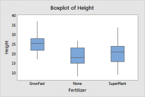
Box Plots divides the data into 4 equal parts such that each part has same number of data points. the lowest and highest one-fourth of data points are shown by lines called whiskers. The middle half are together shown by a rectangular box, which gives name to this graph.
Box plot helps in interpretations similar to Histogram except the one used by histogram for comparison with Specifications. These interpretation include
- Center of Data
- Spread of Data
- Skew of Data
- Presence of Outliers
Over histogram it has advantage in one aspect where Box plot helps in relating discrete X with continuous Y. We will discuss about this application in subsequent articles.
How to make Box Plot in Minitab?
Let us learn making Box Plot using Minitab. Please open given excel file Box-Plot-Data and paste in the Minitab. Follow the command
- Graph>>Box Plot
- choose One Y and simple.
- Click on "Age" and select it.
- Click OK to see your Box Plot.
Please take mouse on any central box and wait to see a small yellow box. Please refer the box in the adjacent figure indicating.
- Q1 - First Quartile - There are 25% data points below First Quartile. Lower horizontal line of box represents First Quartile.
- Median - There are 50% data points below (and hence above) the Median. Central horizontal line of the box represents Median.
- Q3 - Third Quartile - There are 75% data points below Third Quartile. Upper horizontal line of box represents Third Quartile.
- IQ Range - Inter-Quartile Range - It is the difference between Q3 and Q1 i.e. IQR = Q3 - Q1. It represents variation in data. If this range is smaller the spread in data is less.
- Whiskers - Length of whiskers indicate normal process spread. Its maximum length is 1.5 times the IQ Range or the value of actual data, whichever appears earlier. In case any data value is beyond 1.5 times the IQ range from edge of the box, it is called as outlier.
- N - Number of data points - These are number of data points taken make the box plot.
It is one of the most effective way to understand data specially if it not normal.
What are time series plots?
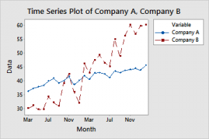
Time Series Plots shows the trend in data over a period of time. It is very useful to understand present performance as well as its improvement over last few month or years. It is often used to check seasonality as well as abnormal behaviour in specific months.
How to make Time Series Plots in Minitab?
Let us learn making time series plots using Minitab. Please open given excel file TimeSeries-Data and paste in the Minitab. Follow the command
- Stat>>Time Series>>Time Series Plot

- choose Simple.
- Click on "Power Consumption-KWH/T" and select it.
- Click on Time/Scale
- Select Stamp and select Month in blank field
- Click OK and again OK to see your Time Series Plot.
The pattern of data with respect to time gives many information like
- Seasonality - High values in month of April and July to October indicates additional power consumption in these months. Also, low value in the months of May and Nov to Mar indicates some major power consumer is not operational in this period. It helps us to understand seasonality.
- Abnormal point - June indicates almost no power consumption and need to understand reasons. Such data is usually not considered
The above three methods of graphical analysis are often used only for analyzing one parameter.